Responsive View
Responsive View is a web design aid used to view your responsive website on a variety of screen sizes.
To use Responsive View please access this site from a desktop computer.
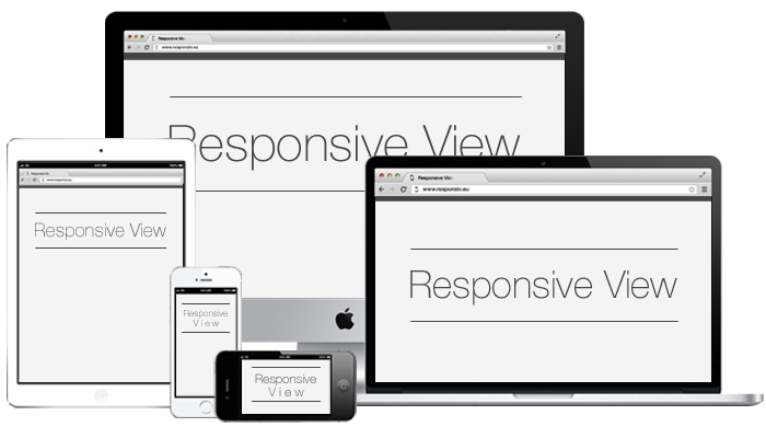
Responsive View was created to aid the development
of responsive websites. It allows you to view a website
as it will appear across a variety of screen sizes,
from iPhones up to 27" iMacs.
Responsive View is only 99% accurate (final testing should always be done on the device itself).
Responsive View is a web design aid used to view your responsive website on a variety of screen sizes.
To use Responsive View please access this site from a desktop computer.